 |
| Front Cover |
 |
| Contents Page |
The contents page follows the same colour scheme as the front cover with the pinks and purple, it isn't as busy as the front cover because it has one main image right justified and the table of contents down the left hand side. I want the reader to be able to locate the page of what they want easily without having to flick through the whole magazine to find the page they want to refer back.
The colours of the font i want to be different colours at random but still the pink and purple.
 |
| Double Page Spread |
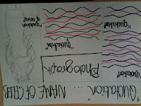
The double page spread should be filling the full page, i want two images of my model on the double page speed, and quotation in bold around in the text. I think by having lots going on i think it will be effective because it will look appealing to the reader and want them to read the double page spread aswel as the advertising on the front cover for the topic of the spread.
No comments:
Post a Comment